Enamel pin design with several specific data
Welcome to the Enamel Pin game! Like many beginners, you've probably done a lot of research on where to start your pin journey, and by now you know that design is the first step.
This blog covers some design points to ensure that your design will best translate into an enamel pin.
Pantone color matching
For the most accurate color scheme, we recommend using the "Pantone Solid Coated" guide. Clearly indicate which areas of your design you want to use the right color values to color when creating your artwork or placing an order through clear instructions.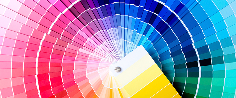
Each color of the design should be outlined. The outline acts as a barrier, preventing the colors from mixing together. These Outlines should not be thinner than 0.3mm
Areas of color
The minimum area for adding color to enamel paint should be 0.3mm

Text size
The minimum font we recommend is 5pt. Please note that this is based on normal fonts such as Helvetica. More complex fonts require larger font sizes.
When using text in your design, be sure to follow the size rules of minimum raised wire thickness and minimum fill color area.
The text of any raised metal areas should not be thinner than 0.2mm and should not contain concave color areas smaller than 0.3mm.
Let's remember!
·Minimum raised wire thickness 0.3mm
·The minimum groove area for enamel color is 0.3mm
·The minimum font size based on a regular font such as Helvetica is 5pt
Now that you know the important basics of designing enamel pins, it's time to get creative!
Any other questions? Book a design consultation with an artist in our team.

 Custom Product Ideas for Thanksgiving Merch
 Custom Product Ideas for Halloween Merch
 Yes to Glitter Enamel Pins
 How to Make Pin Backing Cards